Cookie Pop-up
You all might have visited a website and a pop-up similar to the one above appeared. It asks you for permission to store cookies. Either to accept “all cookies” or with custom settings. Websites are required to ask the user to consent to the (third-party) cookie usage of a given website, which is an essential step towards data privacy of the visitor of the website (user). One reason for this is the fact that many third-party providers (see third-party provider clarification below) are tracking users across websites. They store this information to create sophisticated user profiles that are then used to predict the user’s behavior. (See Machine Learning, Ads and User Profile at the end of this article). Unfortunately, product managers, UX designers, and software engineers are building these dialoges in a way that it is as hard as possible for the user to make an informed decision.
Informed consent
However, the general idea here is to allow users to have “informed consent” to use their private data. This data almost always includes sensitive information like age, gender, interests, location, and more.
Dark Pattern 1
Lets take a closer look at these pop-ups and see how they are structured.

There is something wrong here. The creators of this “dialog” employ two subtle techniques here, that not everybody is aware of. The first technique applied here is given the user the choice between “Accept all” and “Manage Cookies”, with the intend to give the user the option between the easy-way of “just accepting all cookies” and a “more complex” option. The second trick is that the “Accept All” button is highlighted. This is normally done for buttons that are “the best next action” for a user.
For those users who dare to click on “Manage Cookies” to learn more, there is another “dark pattern” that is used by a huge number of websites, including (health) insurance companies.
Dark Pattern 2
The next dark pattern consists of two tricks, which are exploiting key UX concepts that are well researched in the context of HCI (human computer interaction)
- “Button placement” and the idea of using well-known patterns, so that the user recognizes the structure and can easily and quickly navigate the website.
- Using signal colors to highlight the primary “call to action” or button that makes the most sense in a given context
Here is an example that is common, and that exploits both concepts:
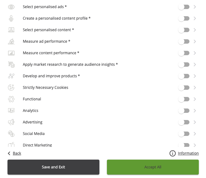
 The user decided not to allow any of the shown cookie types.
There are two buttons here. One would “save” the settings you just made. This is equivalent to a typical “save” button and should be placed on the right side, and it should be highlighted.
There is also the “Accept All” button which is semantically equivalent to “cancel/abort” (ignoring the settings the user made). It should be placed on the left, and it should not be highlighted.
You can see how the button position is swapped and how the action that ignores all the settings previously made is highlighted. The user is effectively tricked into consent, despite the settings they made before.
Other bad examples
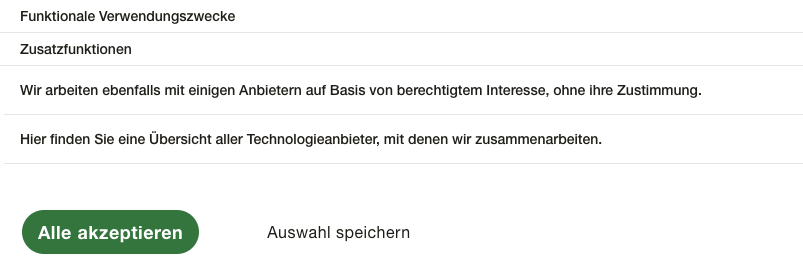
This example from a German website keeps the proper button order but tricks the user by using the second technique (highlighting the wrong button) to trick the user into clicking the wrong button.

Pretending a need
Some companies, depending on their location and the location of their users, are not required to get consent for storing user information or placing third-party cookies. They often inform the user about the fact that they “need to store cookies” for their system to work. Here is an example:

This can be true, especially if the company does not store third-party cookies. However, some companies pretend that they need third-party cookies to “deliver their service” or to “improve their product”. This is usually just a lie, and even though product development often looks into analytics based on third-party user tracking. This is not at all a necessity for any company to develop their product.
Actual informed consent
A proper version of this cookie dialog is easy to do and at least some companies implement it in a way that does not try to confuse and trick the user.
Here is an example from GitLab, a source-code hosting company:

They have an easy-to-understand summary of what cookie types are available and give the user a clear choice without confusing buttons. They still have a default that forces opt-out, but they don’t apply any dark patterns to trick the visitors of their website.
There are even fewer pages that go one step further and allow for actual informed consent and also make the decision for questionable third-party cookies “opt-in”. Like GitHub, another source-code hosting provider.

Why
The reason websites have an interest in tricking their user is financial. When you visit a website that asks you you to “Accept all” cookies, they want to allow Google (and other Ad platforms) to track you across the internet. This huge amount of data is used by ad providers (like Google) to create user profiles and predict the interests and behavior of a user that visits a website. Many websites have so called “ad slots”. This is space on their website used to show advertisements. The website owner can earn money by showing ads on their webpage. Companies running online shops will pay for these “ad slots” hoping the user will click on their image and buy something in their shop. These companies pay Google to display their ads on other websites. The decision what to show to a user is made by analyzing the user-profile made based on the data they collected with third-party cookies.
Ads are not the only but the most common application of third-party cookies. So the only reason people are tricked, and their private data is collected, and processed is for online shops to increase their income per ad that they pay for showing. These shops are entirely unrelated to the pages the user visited in the past.
So when you visit a page for the first time, it is very likely that the page will include advertisements that are custom-tailored to you, based on all the data Google (and others) collected from you on other websites. All of this is enabled by accepting “third party” cookies and tricking people into accepting those cookies.
Conclusion
The best thing to do as a user is to be actually read the “cookie settings” carefully and be careful when clicking the button. Sometimes you even have to search for the “settings” link because it is hard to find.
From UX designers, product managers and software engineers, I expect to act in the interest of their users and take data privacy seriously. This means raising their voice and denying to implement dark patterns, or anything that will harm their users and tricking them into giving up their data privacy is harmful. It is sad and worrisome that we (as an industry) accept the massive collection of private data without any need and that we are implementing dark patterns to trick users. Acting this way is irresponsible and unprofessional, and I hope that these patterns will disappear as soon as possible.
Appendix
third-party providers
(#third-party-providers)
When visiting a website it might be the case that the page is trying to set a cookie for a “third-party provider”, which refers to a party the is not you or the owner of the site that you are visiting. For example, if you visit an e-commerce website it might try to store data for a company you never did business with. That party is the third-party, and it is often a company providing ad (advertisement) services.
Machine Learning, Ads and user profiles
(#ml-ads-user-profiles)
When a website is visited, many websites place third-party cookies so that the third-party (I.E Google for Google Analytics and other Ad-tools) can track the user across websites. This behavior is then stored on a large scale, and no data is deleted for a very long time. This data is then combined with other sources to create full user profiles that include: Gender, age (group), locations (which became more important with mobile devices), religion, shopping habits, brand affinity, job level, the industry you work in, estimated purchasing power, and many more attributes about interests like sports, music, finance and so on. This data is then fed to sophisticated machine learning models, that most very often have the purpose of predicting the best ad to show for the user on other websites. With other words, predicting the ad with the highest likelihood to make the user by the product on the given ad.